Brand · Digital · Communications · ExperienceBrand · Digital · ExperienceCommunications
Healthcare,Made Human.
Designing clarity, trust
and meaningful connection.
01 · Identity + Digital
Senior Care
Pathways
The project
A new identity and website designed to make finding senior care feel calmer, clearer and more personal. The system gives families a trustworthy path into services, resources and the right next step.
seniorcarepathways.com01 / Identity & typography
Roca
Original lettering retained as supplied artwork.
Sofia
Supporting type
ABCDEFGHIJKLMNOPQRSTUVWXYZ
abcdefghijklmnopqrstuvwxyz
0123456789
Calm. Clear. Personal.
A consistent palette, familiar symbols and clear hierarchy connect the identity to the experience.
02 / Color & graphic language
Primary
Supporting
Graphic elements

The location pin and leaves express guidance and possibility.
Home + careThe heart and home express comfort and belonging.
03 / System in use
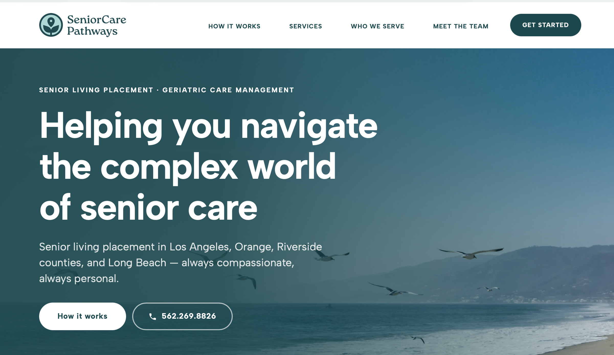

Identity and message studies / Proposed applications
Conclusion
A calmer identity and clearer digital path help families move from uncertainty toward a confident next step.
02 · Fan Experience
Hydration
Station
The activation
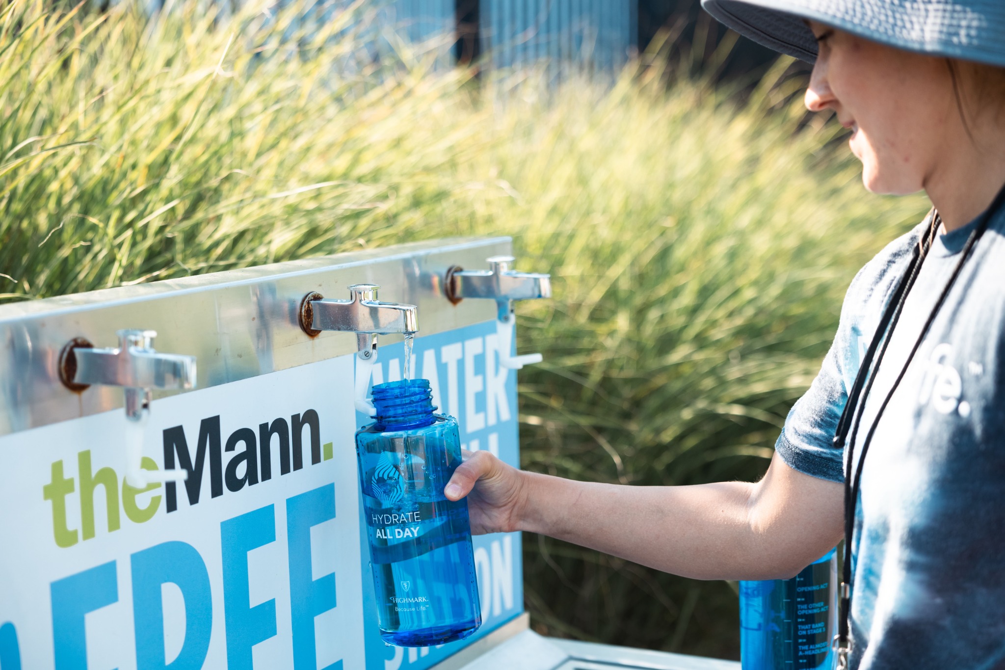
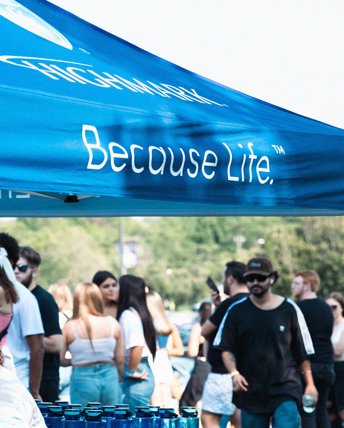
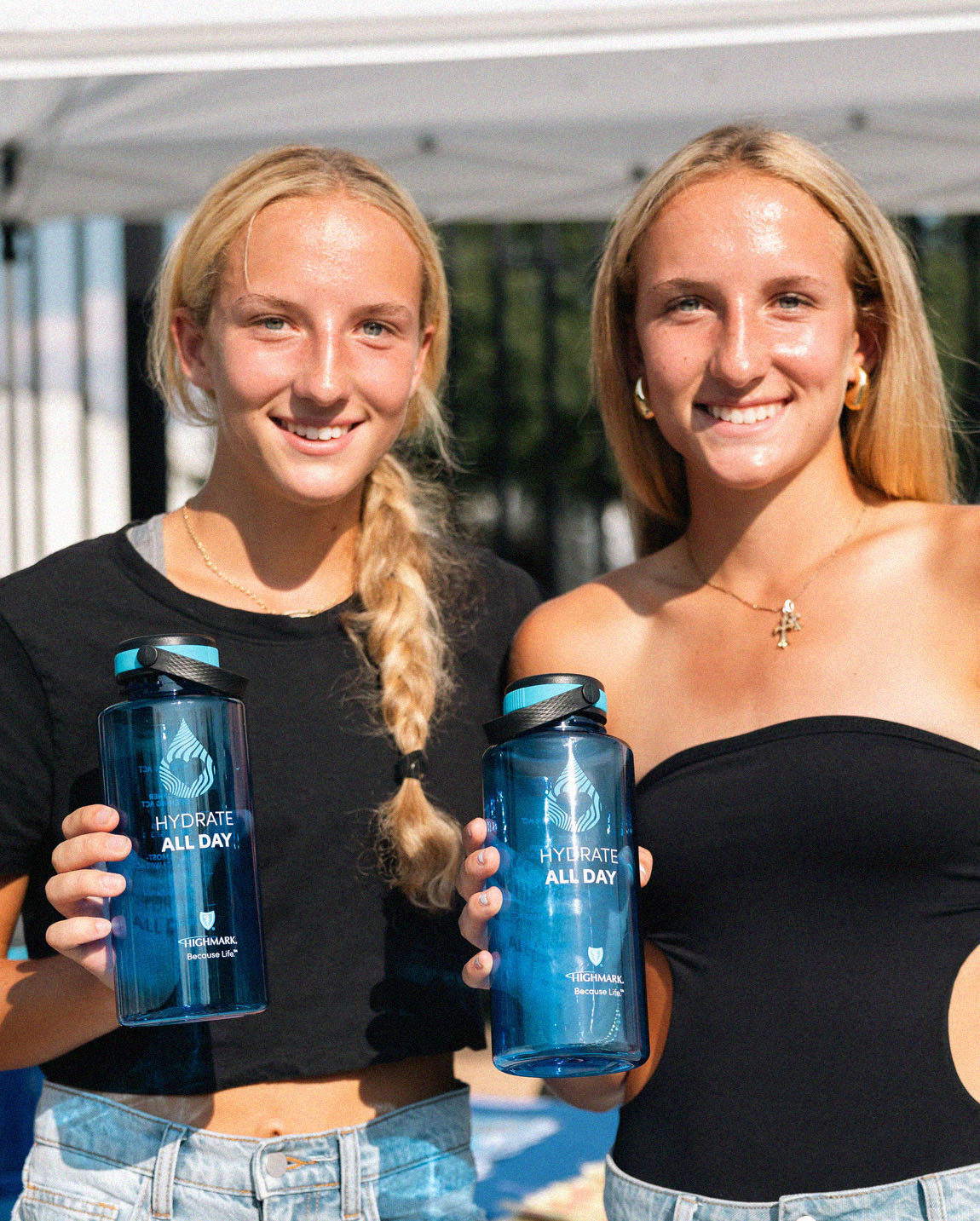
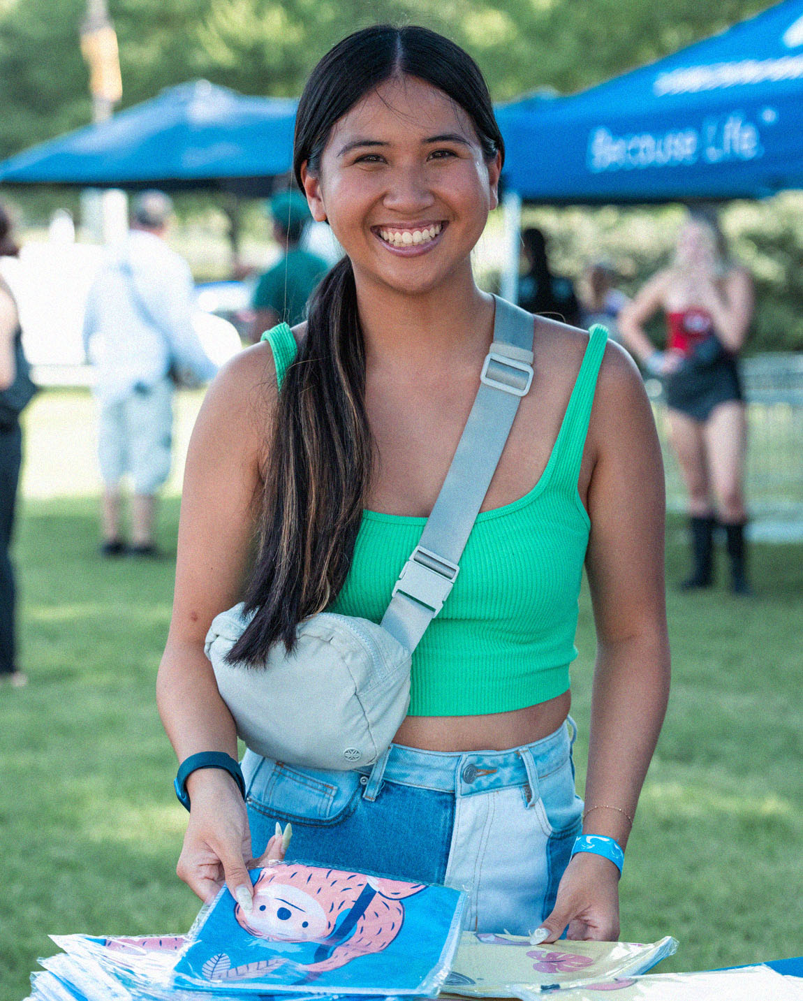
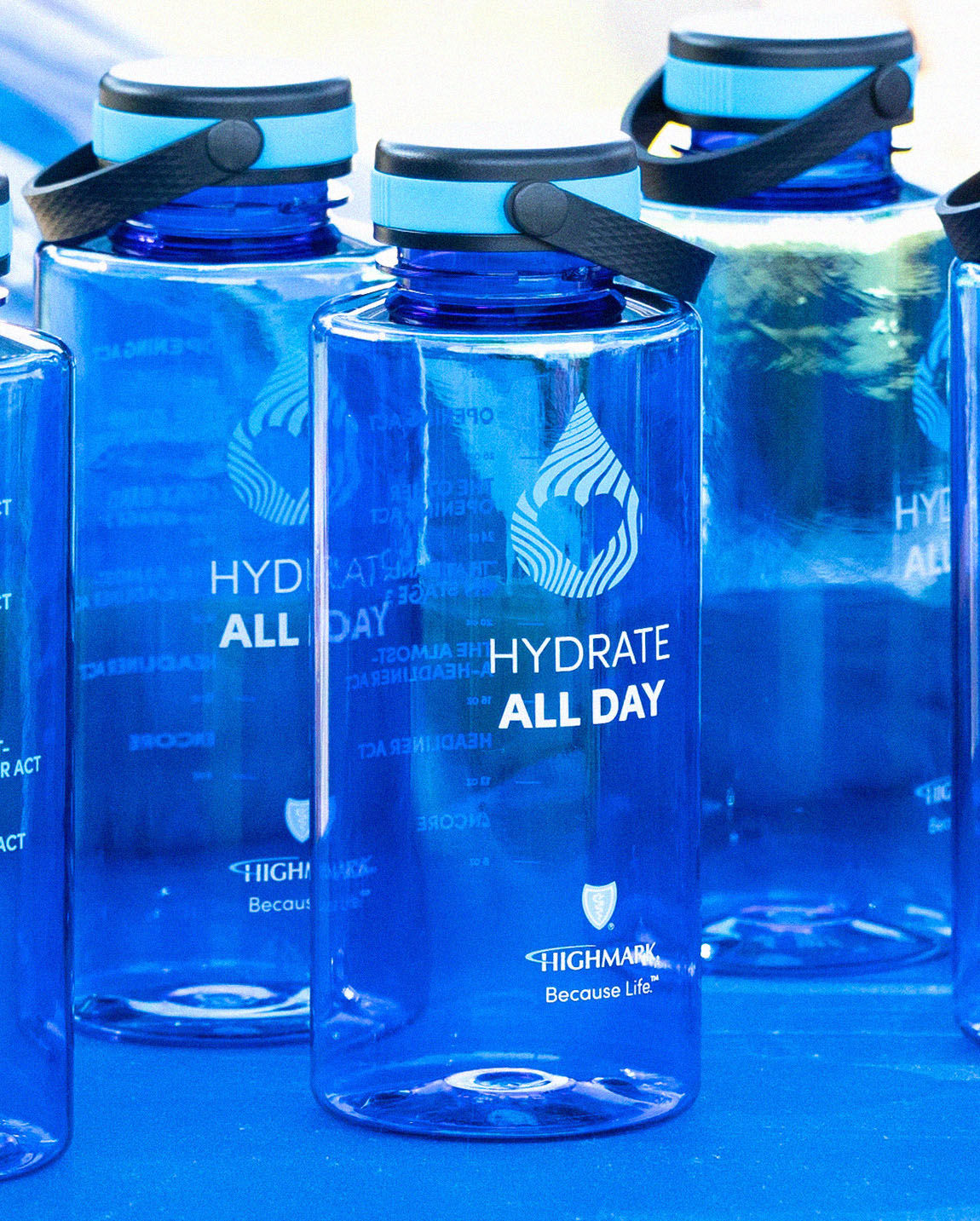
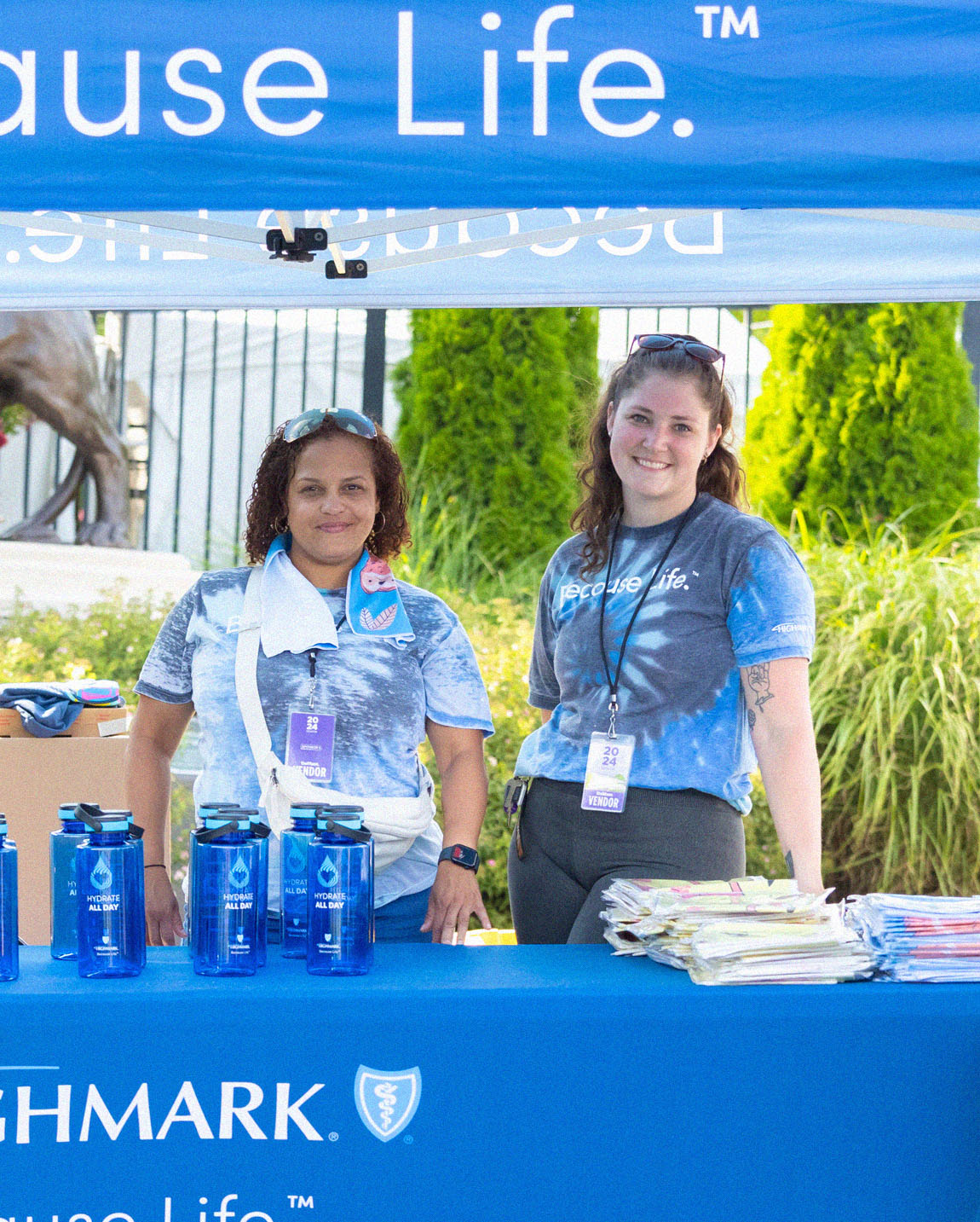
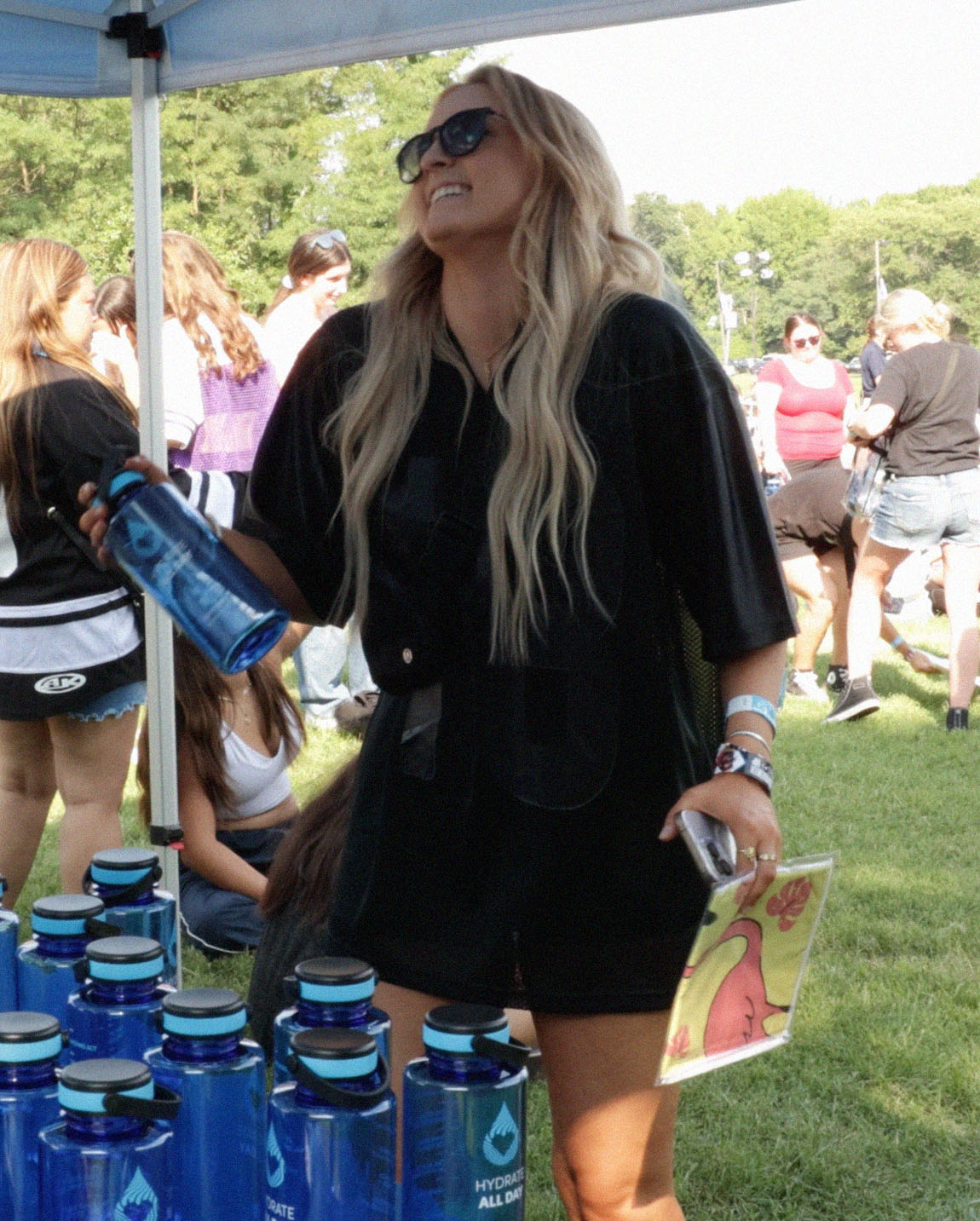
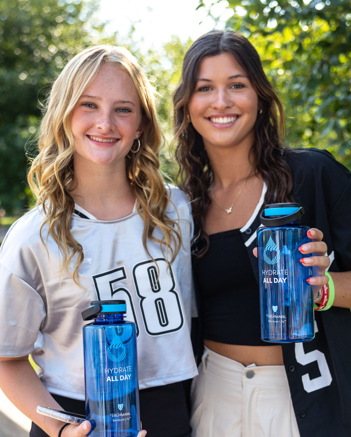
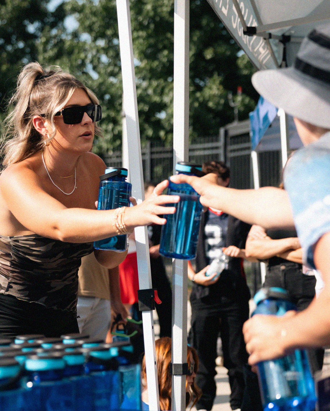
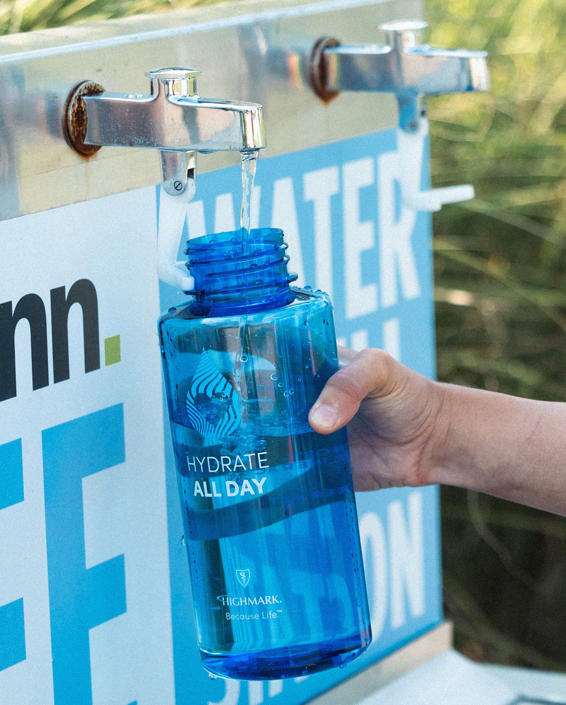
A practical wellness idea made visible on game day. The activation paired an approachable campaign message with a useful fan amenity—making healthier behavior feel immediate, social and easy to join.

Conclusion
Wellness becomes tangible through a useful, memorable experience built around the rhythm of the event.
03 · Communications
Healthcare
Marketing
The work
Newsletters, brochures, posters and communication tools that turn detailed healthcare information into clear, useful guidance. Strong hierarchy and approachable storytelling keep the audience—and the next action—easy to understand.
Conclusion
Complex information becomes more approachable without losing the rigor healthcare communication requires.